Challenge
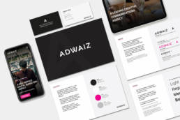
The company felt that their current branding needed updating to reflect their current values. The branding was predominantly pink and they were very keen to move away from this to a clean, fresh look and feel using black and white as the primary colours and pink to highlight key information. This required all marketing materials to be redesigned to work in harmony and provide brand consistency.
Brand Guidelines
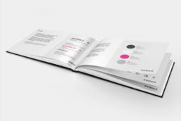
Brand guidelines were initially created for the company to ensure all content was consistent. This involved determining brand colour palettes, fonts, iconography, imagery and logo use together with other specifications required to ensure the brand image was consistent.
Website
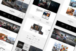
The company’s website was predominantly pink and looked very outdated, so once the brand guidelines were approved by the client the website could be designed. One of the agencies unique selling points was its high quality creative design which needed to be showcased throughout the website. The user experience on the site needed to be improved as there were no clear user journeys and the website’s primary function was to generate leads and enquiries about the services the agency provided.
Video
The company wanted to run an advertising campaign across Facebook and Google Ads to generate new business. They wanted to use video advertising to do this as video has a higher conversion rate than static advertising. The video needed to showcase the company’s values as well as display the services provided. In addition, the video then needed to be broken down to be used as more specialised advertising for each of the individual services.
Presentations
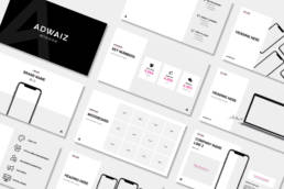
A series of pitch decks and internal presentations were updated using the new design along with internal presentations ensuring brand consistency. The presentations that were currently in use were messy and looked dated so it was vital that these were clean and modern incorporating the new design since in the majority of cases these were their client’s first impression of the company.
Business cards
Team members also needed their business cards updating as the old ones had dated messaging and also were not on brand. The company wanted to keep the business cards clean and simple with pink used as a highlight colour. Samples were ordered from various suppliers and a meeting took place with the CEO to decide which best suited their requirements.
Adwaiz Branding
Adwaiz is a leading Creative Communications Agency with Nordic roots based in London. It specialises in creative content, social media management, influencer marketing and paid media. Adwaiz provides a cutting edge service through fantastic creative solutions and deep insight enabling customers to inspire and engage through the use of social channels.
ClientAdwaizServicesBrandingYear2019Linkadwaiz.com


